
WebCheckout
Web Checkout is a web platform that allows students to browse and rent equipment to complete school projects that require resources such as cameras, lighting, and audio equipment. The platform allows administrators to monitor the inventory management and equipment checkout process.

Challenge
How might we streamline the equipment rental process for both the students and administrators using the platform?
The current system has damaged equipment and late returns that go unreported, causing long waitlists for students who want to borrow equipment. For administrative users, they need to manage the inventory and notify students to avoid late returns of equipment.
What did WebCheckout look like before?

Solution
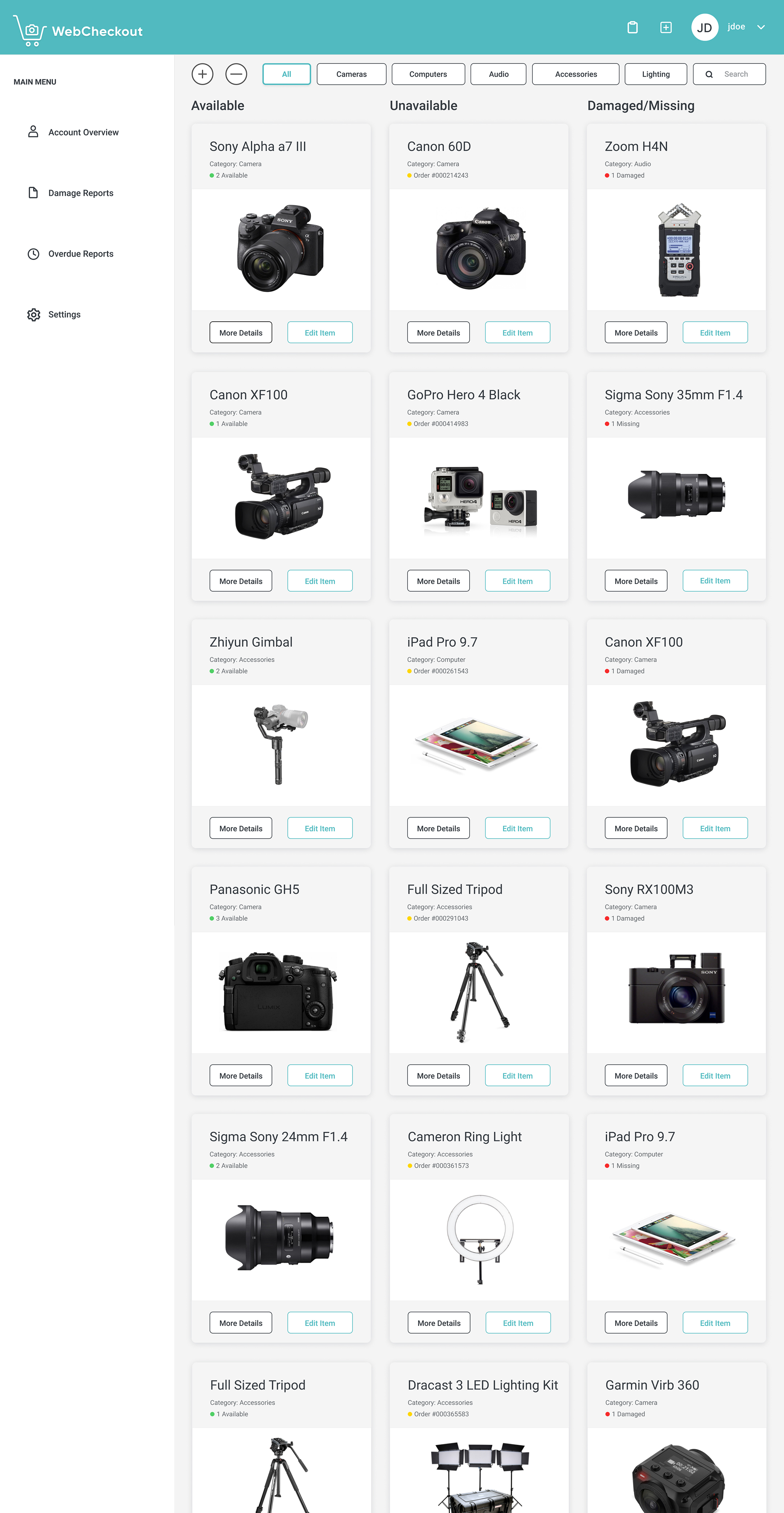
A smoother rental and return process
The new platform allows users including both students and staff to easily navigate, locate what items are available to rent and when they need to be returned.
Scroll the image below for a quick peek of the solution:

Research
Align project goals by understanding the users
The target users are first year students, returning students, and administrators of the rental system. To gain insight on the target users, I conducted 4 interviews and received 26 surveys responses from different target users.
The key findings were:
- New students found the experience of renting out equipment overwhelming and confusing
- When students return late items, others on the waitlist need to wait longer until use
- It is challenging to keep track of return dates, resulting in higher chances of late returns
- Administrators experience confusion with the inventory management system when new data is not inputted
I also created three user personas summarizing my research on the goals for different users:
Design
Validate assumptions and iterate through design
After identifying the users' problems, I created a site map and designed iterations with assumptions based on the stakeholder's core needs from the user research. I then kept iterating based on the insights from the user research to uncover solutions for the core needs and tasks of the users.
Student site map

Administrator site map

Wireframes: User Flows and Scenarios
Creating user flows and scenarios for all types of users gave me clarity on prioritizing features that would address different pain points. I realized that the site maps above were inconsistent with what the target users' main tasks were. As a result, I combined the Student Account page with the Administrator Portal to avoid redundancy.
Students: Combined the Browse Equipment page and Browse/Rent Item page to simplify the user flow and avoid redundancy.
Administrators: I combined the Admin Portal page and Student Account Review page from the site map by creating a feature on the Admin Portal to search for students and view their accounts.
User need #1
Easy and faster browsing
One major pain point is browsing through the items page as users had to look through the list until they found what they needed. As a solution, I created a feature to filter items, allowing users to easily find what they need.

User need #2
Notification of late payments
Administrators need to notify students of overdue fees, check the status, and update their account. The task gets tiresome as they go back and forth between emails and WebCheckout. The new design shows the balance on the student portal for students to easily be notified when they need to pay late fees.

User need #3
Flexibility when reporting issues
Reflecting on the user personas, administrators wanted to be able to input data whenever they wanted for an item. I added an option to report a problem on the individual items page to allow flexibility when reporting a problem.

Delivery
Creating a cohesive design
I created a visual design guideline for the platform to ensure that the iterations and prototype had a consistent brand. I added the three traffic light colours as semantic constraints for students to motivate good user behaviour.

Final Design
Easy navigation for students
Simple and quick checkout process for administrators
Next Steps
Due to the project timeline, I only got to interview one student user for usability testing, receiving valuable feedback and perspective on the problem space. The participant successfully navigated through the student portal, rented an item, and learned more about an unfamiliar product. The participant discovered issues that needs improvement, such as the icons on the top right corner that were inconspicuous for the user.
Many of the decisions made for this platform were based on the insights gathered from the user interviews and surveys in the research phase. For the next steps, I would test these assumptions with different users to validate the user experience decisions.
Takeaways
WebCheckout was my first individual research and design project. With the time constraint and manpower, conducting detailed primary research was challenging. However, since I focused on brainstorming sketches and creating a detailed site map, I was able to prioritize the platform's features.
Working on this platform taught me a lot about user research. I learned to apply the insights from the research to the make informed design decisions on the iterations for the user experience and interaction design of the product. It helped me avoid potential bias and assumptions of user needs while focusing on the target users' core needs. Another important thing I learned was to maintain a consistent visual guideline, which improved the efficiency of my design process.
